
I love her "iPad!" What a clever comparison. Read about it on her blog.


 Esther Aarts is a illustrator/designer/typographer based in the Netherlands.
{all images belong to artist: Esther Aarts Website}
 Esther Aarts is a illustrator/designer/typographer based in the Netherlands.


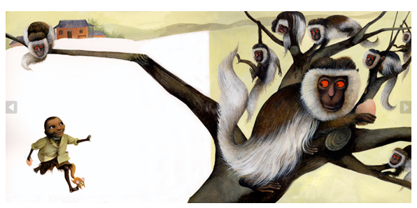
 From commercials, videos, animations, greeting cards, story-boarding, book covers, etc, Jon Klassen does it all. I remember him most from the Royal Bank of Canada Ad (the second image with the deer) but it seems like he is everywhere. He is from Canada but lives in Los Angeles now. Enjoy peeking at his work here, but check out his website if you want to see so much more.


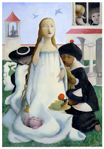
 I first learned of Ana Juan's work when I went to Spain one Christmas and saw her posters and t-shirts for sale at a flea market. I found out she was a Spanish illustrator and soon saw her work in many Society of Newspaper Design award books. Since then she has illustrated for the New Yorker and many childrens books - one of my favorite was about Frida Kahlo. She is phenomenal! Enjoy!
 I've been potting succulents lately - ever since we decided to save water and change our yard to desert plants. It's been so much fun. This pot is my favorite so far. These plants don't skip a beat. You can rip them apart, dig them up, shove them in a pot and they take it all in stride. They look happy to me and they make me smile. Hope something makes you smile more than once today!


 Take a look at our short board birthday cards and thank you cards. Our surfer and surfer girl are back again. They are printed on French Paper, Starch White Speckletone. We still have a few more cards to print in this wood-cut style but we'll get it done when we can - it's summer! Hope you all had a great weekend.


 I came across these mugs at Delphine's blog the other day and couldn't believe my eyes. Two things I love together - coffee mugs and Eleanor Grosch's art! If my husband would let me have another mug in the house, I would get one or two of these. Who could decide between them anyway!


 Although Eleanor's work has Charley Harper influence, she certainly made her style her own. So clean, geometric and beautifully simple - I love her work! Wow!
 Sometimes, in a pinch, you have to re-use an illustration that has already run in the newspaper. It happens - you run out of time, inspiration or illustrators. As luck would have it, you've illustrated the same subject before. It may have been 2, 3 or even 4 years before. Will the readers notice? Should we run it again?

 I stumbled across Primele at Oh So Beautiful Paper this week. I love the idea of using rubber stamps for return addressing envelopes for a wedding. Especially with hand-written calligraphy - it keeps the personal touch alive. I know I'm all about letterpress, but in this economy you have to cut some corners. Anyway, I checked out Patricia Mumau's blog and came across a letterpress wedding invitation she had hand-lettered and drawn. To top it all off, it was on chipboard, my favorite. Gorgeous!


 I can't say enough how much I love Charley Harper. To me, he is the most influential illustrator of his time. I see his inspiration in so many illustrators today, me included. He is one person I would love to have tea with and hang out with in his studio. I missed my chance, but at least I can enjoy his huge body of work forever.

