Friday, March 25, 2011

Andrew Bannecker {inspiration}


I came across Andrew Bannicker recently when he was featured in 3x3 magazine for his Coke ads. I thought those ads were just gorgeous so I wanted to see what else he could do. I wasn't disappointed! He is amazing. I love his quirky, folk art style and his textures are right up my alley. His color palettes are surprising and fresh. Check out his site for yourself - it will brighten your day, I promise.

Wednesday, March 23, 2011

Mom's Recipes {illustration}


This illustration was for a story about recipes passed down from our mothers or family members. The story was by Doug Williams for the Union-Tribune. I think what made the illustration, for me, was being able to use the actual scan of Doug's mom's recipe. I especially love the spatter near the bottom of the steam - you just know the recipe was used over and over. The one recipe I miss of my mother's was her lasagna. Ricotta cheese was hard to get in Panama so she just made do with cottage cheese. I never knew the difference and my mouth still waters thinking of it!

Tuesday, March 22, 2011

Butterfly Stationery {letterpress}


We printed these note cards for our good friend, Teresanne, from Teresanne Creative Studio. Her logo is a beautiful, graphic butterfly that we printed in blue on 100% reclaimed cotton paper. We paired them with faded blue envelopes. I just hope she is not too stingy with them. Set them free!

Tuesday, March 15, 2011

Pretty Pincushions {illustration}


I loved illustrating these plants! They have been my obsession ever since I noticed one in a neighbor's front yard last year. I knew I had to have one!  I didn't realized how many varieties there were until I got Nan Sterman's story, but now I am in love with them all! My husband gave me the Scarlet Ribbon variety (the one near the top of the illustration) for my birthday. Just what I wanted!

Friday, March 11, 2011

Karolin Schnoor {inspiration}


I've been seeing London-based illustrator Karolin Schnoor's work on some of the blogs I read lately and I thought I would show a collection of some of my favorites. As a lover of mugs, I found these on her website - she made them for Christmas gifts. What a great idea! I love the folk art look to her work. I can just imagine her sketchbook and all the doodling she must do. Her shop has a collection of cards with animals that can be cut out and turned into movable art. Brilliant.
Happy Weekend!

Thursday, March 10, 2011

Child's Play {letterpress}


This poster, letterpress printed by Studio on Fire out of Minneapolis, is absolutely precious. It was a collaboration between a father and son. It was hand drawn by the son who is six years old! It was then rearranged on the computer and letterpress printed to be the work of art you see above. I never tire of checking on this letterpress studio's blog called Beast Pieces. Studio on Fire is hot!

Wednesday, March 9, 2011

Turandot {illustration}


This illustration for Turandot was such a pleasure to do - not to mention educational. I have always loved the song "Nessun Dorma," but I never knew it was from this opera. When I got the assignment, I did some research and about fell out of my chair. I knew I had to see Turandot! Luckily for me, my friend, Michael, wanted to go as well. We saw it at the San Diego Civic Theatre - it was such an amazing experience! 


The sets were designed by David Hockney and, wow, they were spectacular. The play between orange and blue as well as rich red and light green took my breath away. Oh, yes, and the singing did too! The pictures above of the set designs are from David Hockney's site. By the way, the costumes were designed by illustrator and children's book author, Ian Falconer. He is most know for his books about the adventures of a pig named OLIVIA. So much talent, I could scream - or squeel!

Tuesday, March 8, 2011

Melaleuca Magic {illustration}


This is one of my illustrations that ran with a story on bottle brush plants or Melaleucas. The bee was an after thought that made the illustration so much better. See the story by Nan Sterman here.

Monday, March 7, 2011

Nena Baby Shower Print {letterpress}


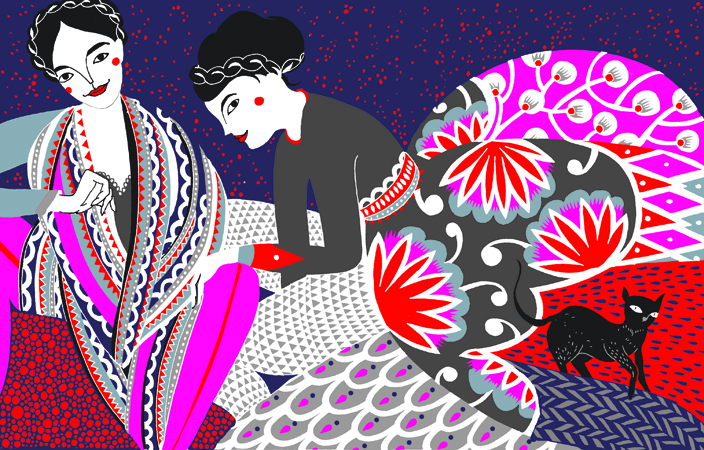
We printed these baby shower invitation/prints for our friend, Gloria. She created a piece of art that we could print as her invitations, but could also be framed as a print and fit perfectly in an IKEA RIBBA square frame. I love the retro illustration of the girl she came up with! I designed the rest of the invitation far enough down so it could be cropped out in a square frame or fit in a 5x7 frame if you wanted to keep the type. They were printed on double-thick 220# Crane's Lettra reclaimed cotton paper. We also printed extra of the pink plate and I cut them into cupcake toppers. The shower was just lovely. See my friend Ani's blog to see way better pictures and learn all about the food at this event. Ani is a photographer, dog lover and food expert - you will not be disappointed.
Now all we need is for little Nena to show up - she's already late!

Friday, March 4, 2011

Mengsel {inspiration}


I came across Mengsel on the Print & Pattern blog recently. Mengsel is work of designer/illustrator/printmaker Luzelle Van der Westhuizen. She is a London based artist, originally from Cape Town, South Africa who mixes Scandinavian and African design to create lovely silkscreen prints and textiles for the home. On a clever note, "mengsel" is an Afrikaans word that means "mixture." I hope her work inspires you too! Happy weekend!

Check out Mengsel etsy shop here. {all images from Mengsel shop}

Thursday, March 3, 2011

Photo Finish


Over the holidays, I used Photoshop for what it was invented for - a photo! I had taken a picture of my son with my phone and, for some reason, the file got corrupted {see top image.} I felt it captured such a beautiful moment. I loved the lighting and his expression was priceless - I had to do something. I emailed the photo to myself, opened it in Photoshop and started piecing it back together - pixel by pixel, in some places. I decided to keep a little of the color change that was happening and add another strip across the bottom to make it seem intentional. After a tighter crop, the bottom image is the final result that became a Christmas present for my husband! I'm so glad I didn't hit the delete button on my phone.

Wednesday, March 2, 2011

Bridal Shower Invitation {letterpress}


This is a bridal shower invitation we printed for Alchemy Fine Events and Invitations. The deep purple and golden yellow printed beautifully on the double thick Crane's Lettra cotton paper. I wish we could print on that paper all day! Have a nice one.

Tuesday, March 1, 2011

Living Alone {illustration}

This illustration ran with a story about how people's health declines if they live alone. I had a lot of fun with the texture in the background. It almost felt like painting. I love Photoshop! Have a great day - and find a roommate!

{image belongs to the San Diego Union-Tribune}